Building clarity, consistency, and accessibility into a complex enterprise platform.
Project Overview
As DeVry’s marketing site evolved, so did the need for a scalable design foundation — one that could streamline collaboration across teams, support accessibility, and work seamlessly within Adobe Experience Manager (AEM).
The solution: a unified design system built for clarity, consistency, and long-term growth.
My Role
As lead UI designer, I played a key role in implementing the new design system — bringing strategy, structure, and polish to a multi-team effort. I:
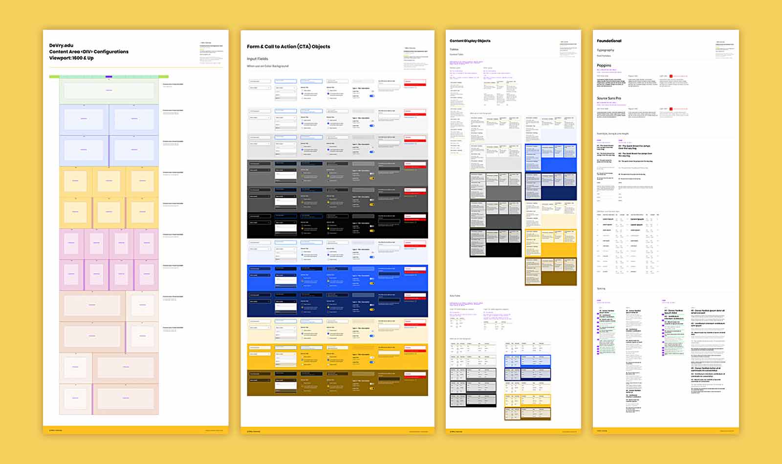
Applied Atomic Design principles to build scalable UI components
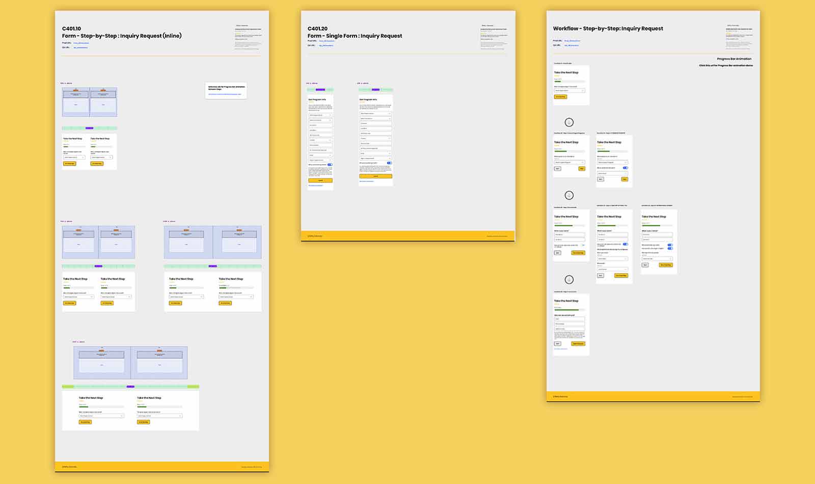
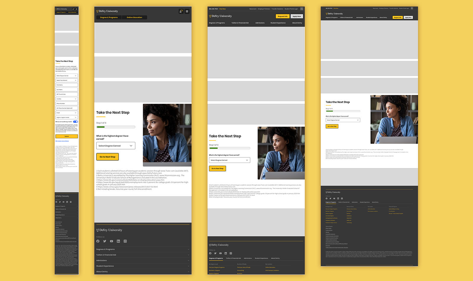
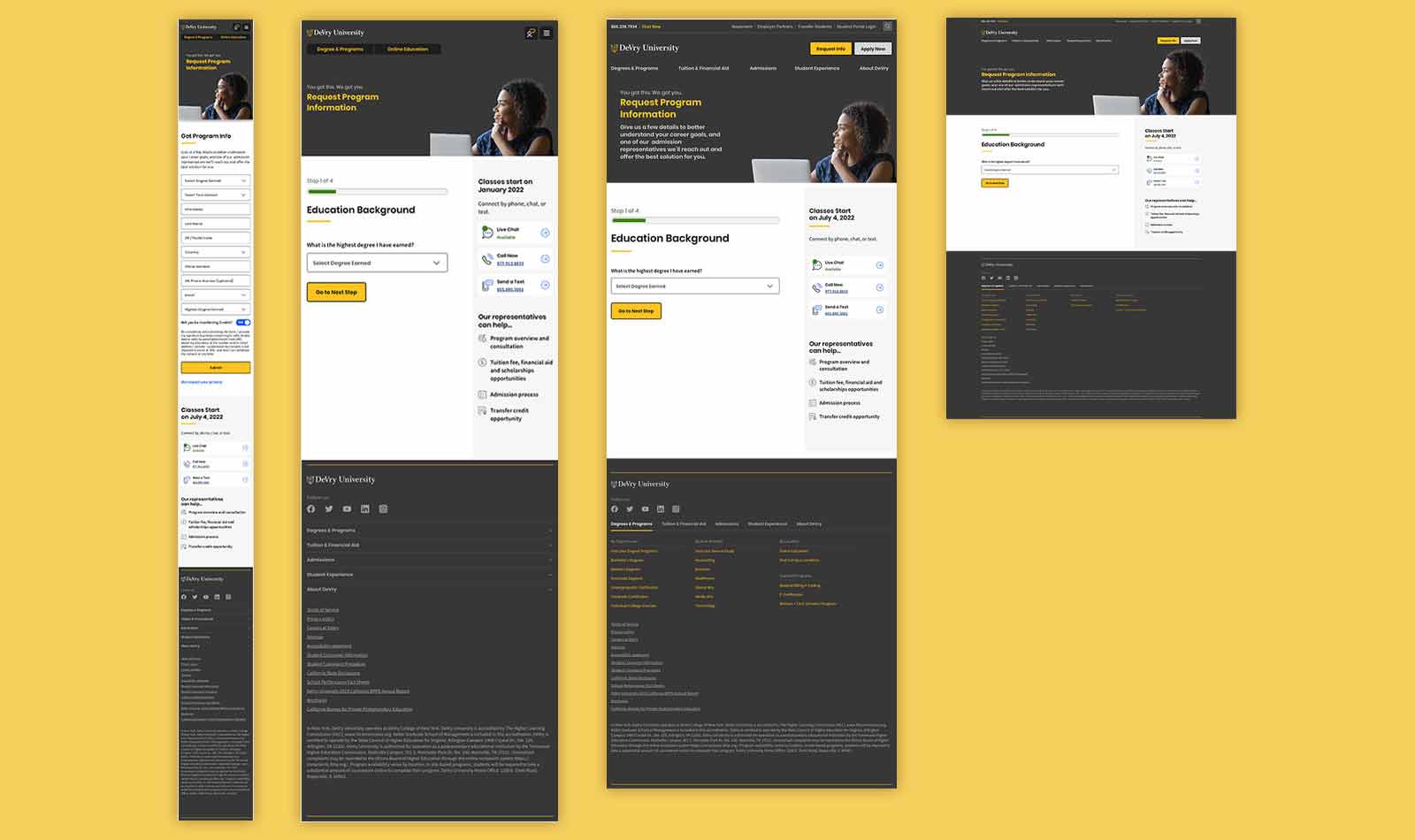
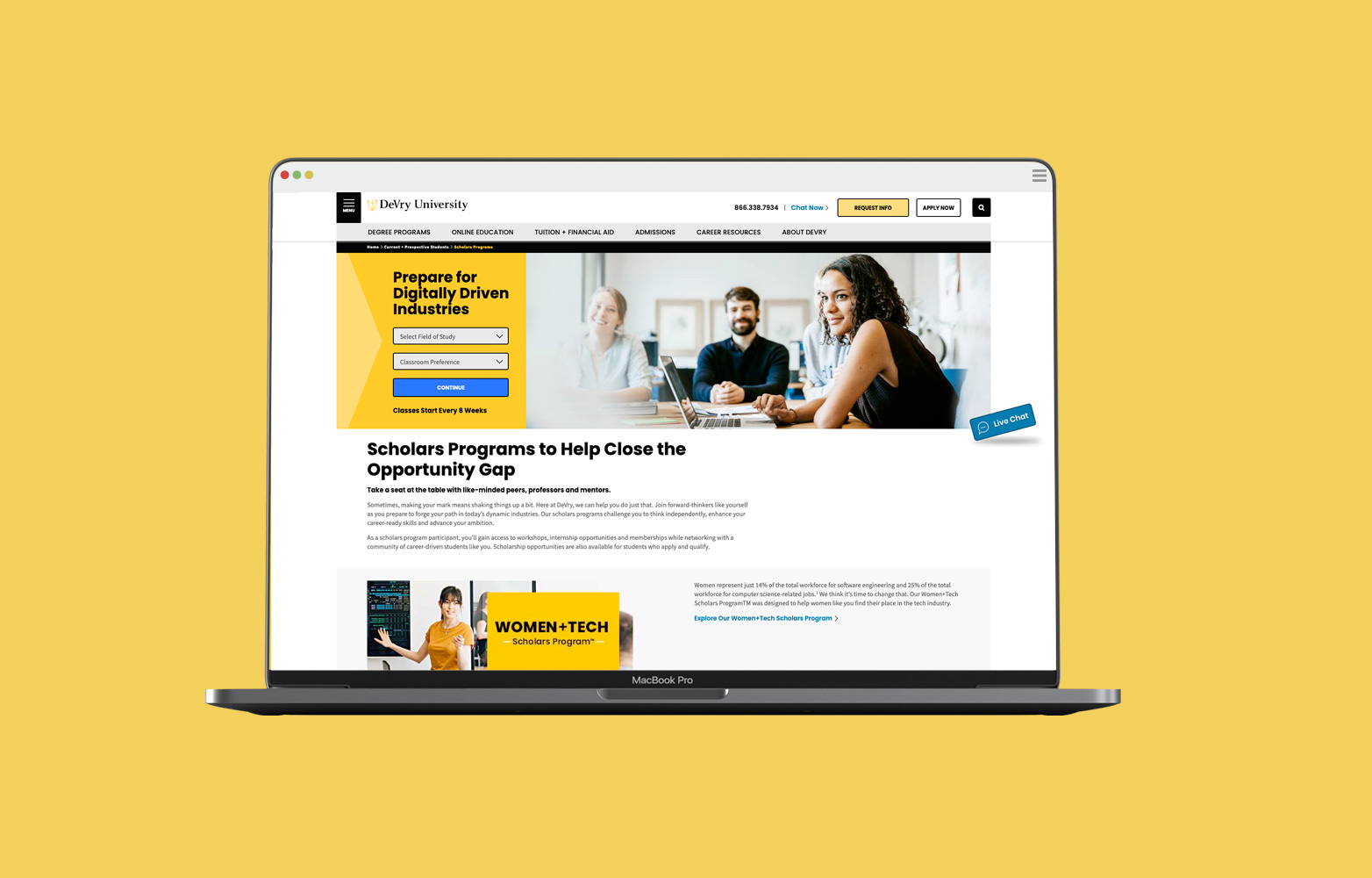
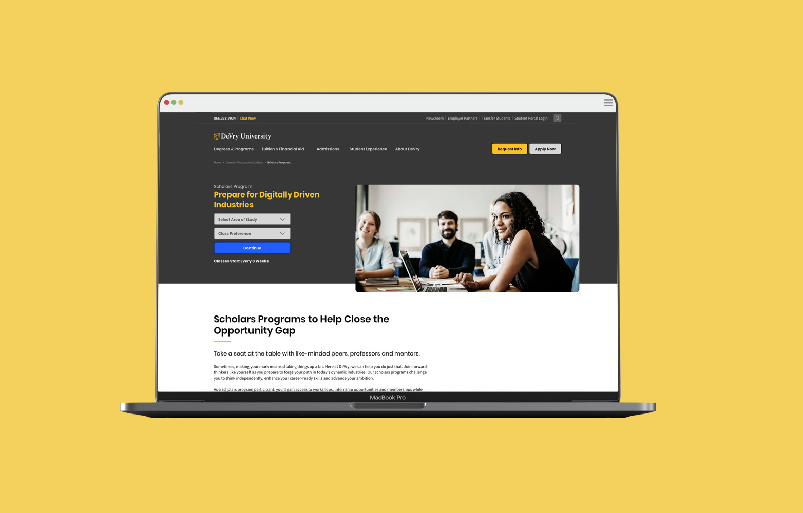
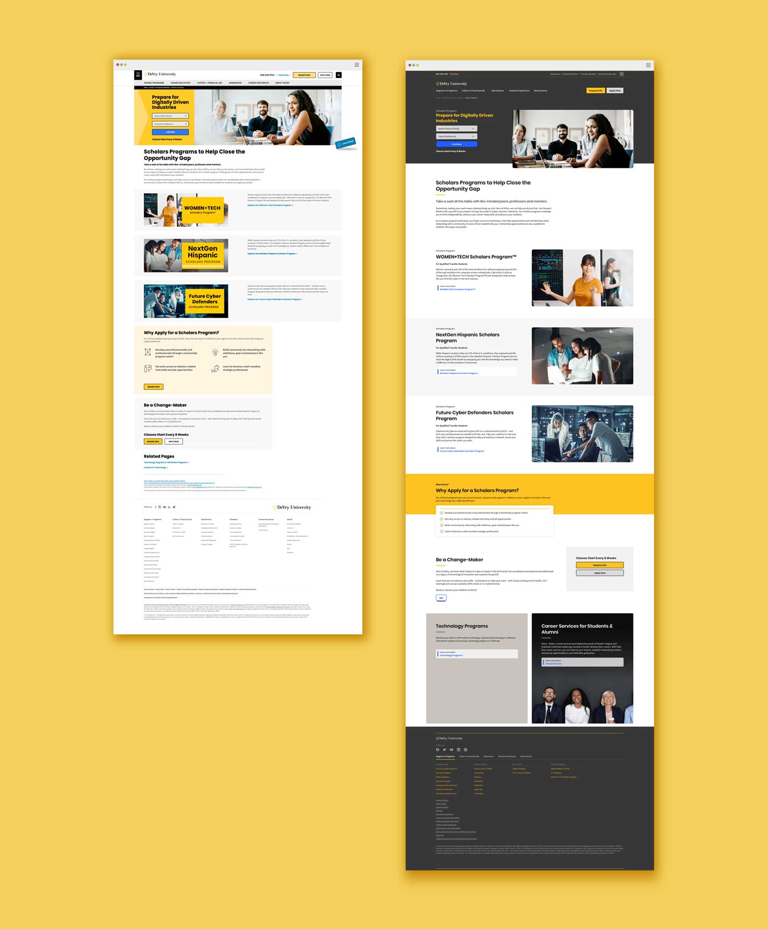
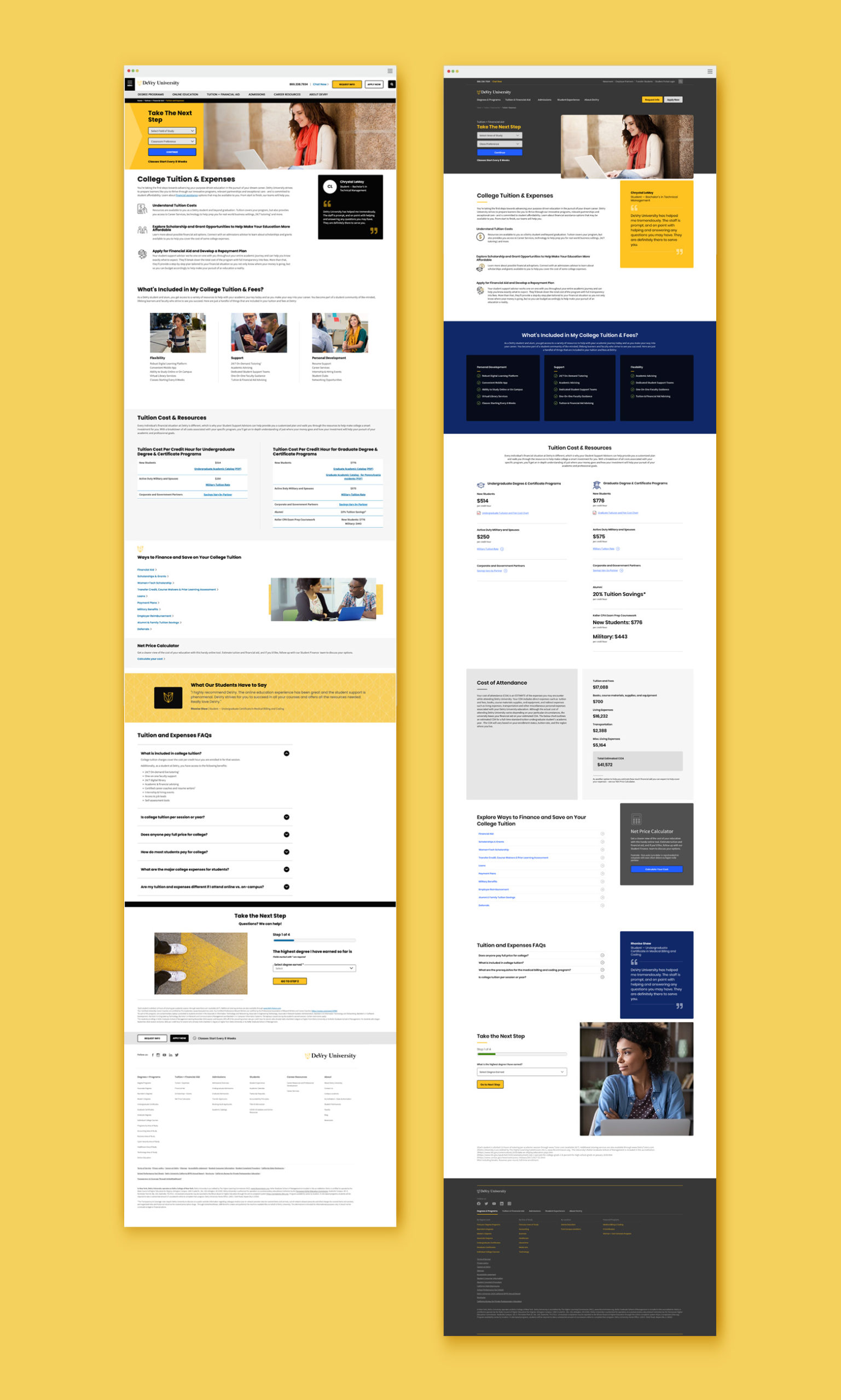
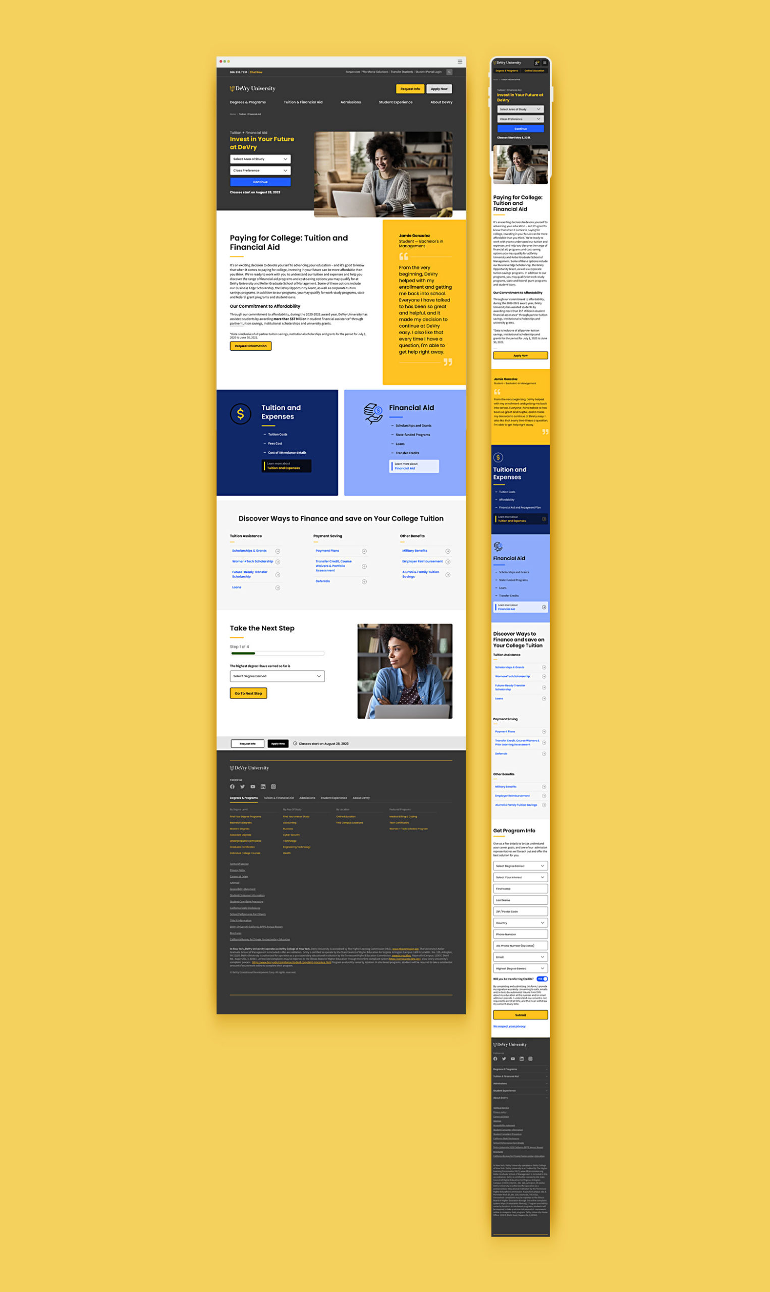
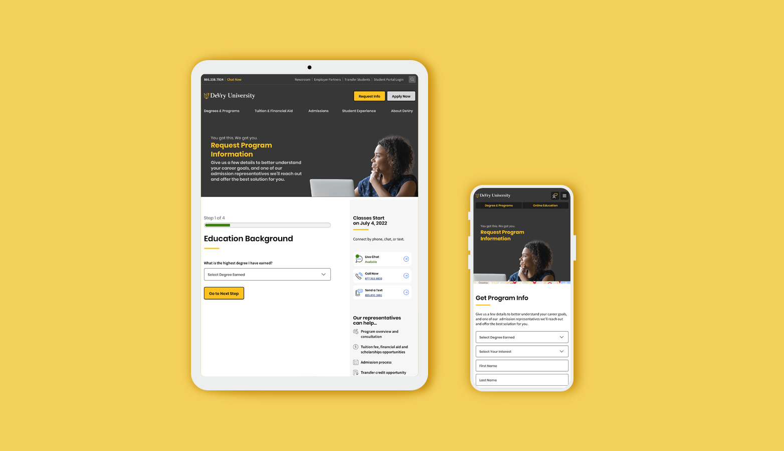
Designed templates and page-level layouts using a growing UI pattern library
Partnered with developers and content authors to ensure fidelity in AEM
Supported QA and UAT cycles to uphold design integrity through launch
Design Framework Analysis
Design Approach
Working within a newly established UX and content architecture, I helped translate structural logic into user-friendly, accessible visual systems.
Key considerations included:
Designing with WCAG 2.1 AA compliance in mind from the ground up
Ensuring SEO-friendly structure and mobile responsiveness
Building UI patterns for reusability and flexibility across teams
Component Strategy
Each element — from buttons to full-page templates — was crafted with reusability and growth in mind.
Atomic and molecular components were used to create modular page structures
Design was driven by content models and guided by system-level strategy
Patterns were documented to reduce ambiguity and streamline dev handoff
Impact
The design system provided a clear foundation for ongoing work — increasing efficiency, reducing visual inconsistency, and empowering cross-functional teams.
Streamlined build cycles and faster design-to-dev handoff
Improved authoring experience in AEM
Established a baseline for accessible, scalable design
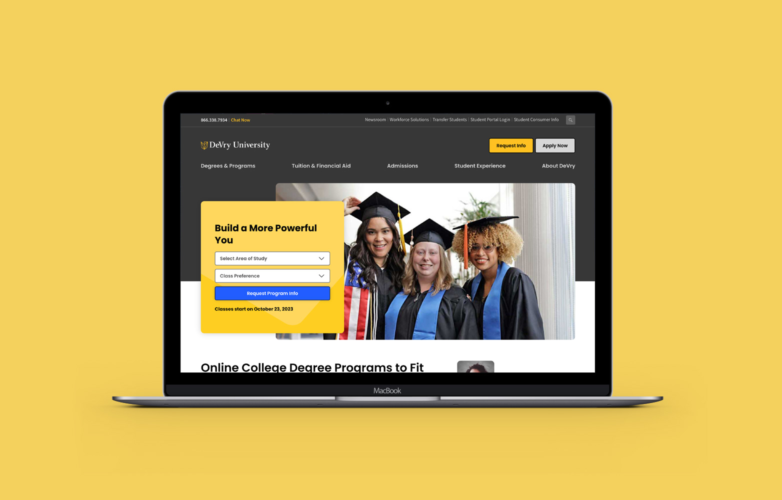
Final UI & Design System
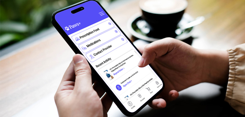
The interface is designed to feel clear, caring, and easy to trust — especially in moments of stress. I created a modular design system with accessibility and scalability in mind.
Key visual principles:
Soft color palette for emotional warmth
Strong visual hierarchy to guide action
Mobile-first design with focus on clarity
Impact Highlights
To surface user value more clearly, here are key outcomes from testing:
80% of testers found the autoship feature “extremely useful”
Users described the UI as “clean,” “reassuring,” and “intuitive”
Accessibility tweaks (contrast, spacing) got positive feedback from all testers
Paws+ showcases how thoughtful, user-centered design can reduce stress and simplify care—making life easier for both pets and their humans.
What I Learned
Designing within a complex system pushed me to think beyond screens — about how design empowers teams, not just users. This project sharpened my ability to work cross-functionally, translate strategy into scalable components, and create clarity across a growing digital ecosystem. The impact wasn’t just visual — it was operational.
