Helping pet parents manage care with less stress and more confidence.
Project Overview
When caring for a pet with medical needs, every detail matters. From remembering medications to juggling vet appointments and food orders, it can feel overwhelming. As both a designer and a dog owner, I wanted to create something that could ease that emotional load.
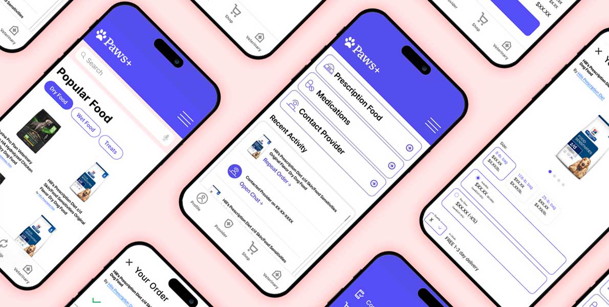
Paws+ is a mobile app concept built to support pet owners navigating daily care routines. With refill reminders, autoship options, and in-app vet messaging, the app is designed to bring calm to the chaos.
My Role
As lead UI designer, I worked across UX strategy, wireframing, visual design, and prototyping. This project was completed during my Google UX Design Certification, where I:
Designed core user flows and mid-to-high fidelity wireframes
Led usability testing and iteration
Developed a scalable design system with accessibility in mind
Crafted the final UI with a warm, human tone
User Research & Insights
User interviews made one thing clear: caring for a pet with medical needs is stressful and fragmented.
Top pain points:
Forgetting medication doses or food reorders
Juggling multiple vet portals and communication tools
No central place to track it all
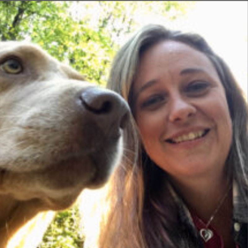
Meet Emily
Emily, a working professional and primary caregiver to a chronically ill dog, inspired the product direction. Her challenges—like forgotten doses, scattered records, and last-minute food runs—drove key features like:
Autoship baked into checkout
Gentle reminders and alerts
Secure vet messaging and record storage
Mapping the Journey
Mapping Emily’s experience helped identify emotional pressure points, particularly around last-minute food orders and forgotten appointments. These became feature opportunities:
Autoship baked into checkout
Gentle reminders and alerts
A dashboard to surface key actions at a glance
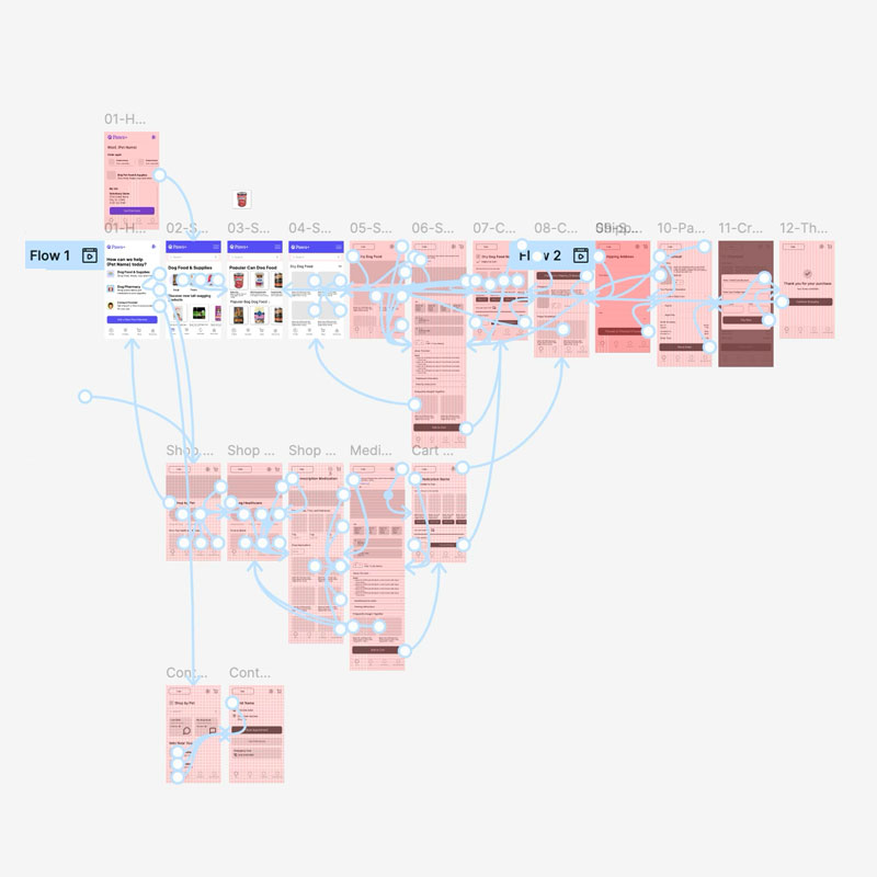
Low-Fidelity User Flow Paths
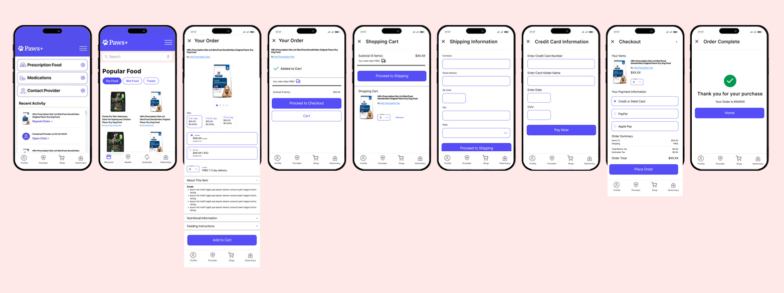
Wireframes & Testing
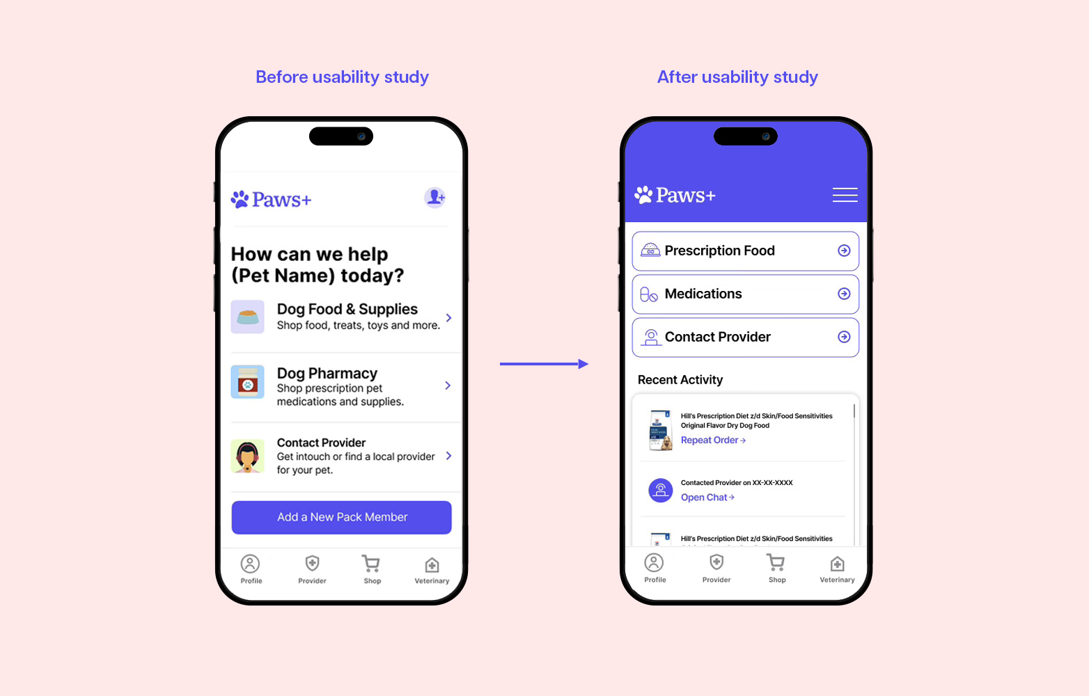
Mid-fidelity wireframes explored layout and hierarchy. I tested early concepts with users and refined the flow based on:
Misunderstood buttons and menu labels
Confusing task hierarchy on the home screen
Need for simpler onboarding and dosage entry
User Study Mockup
Final UI & Design System
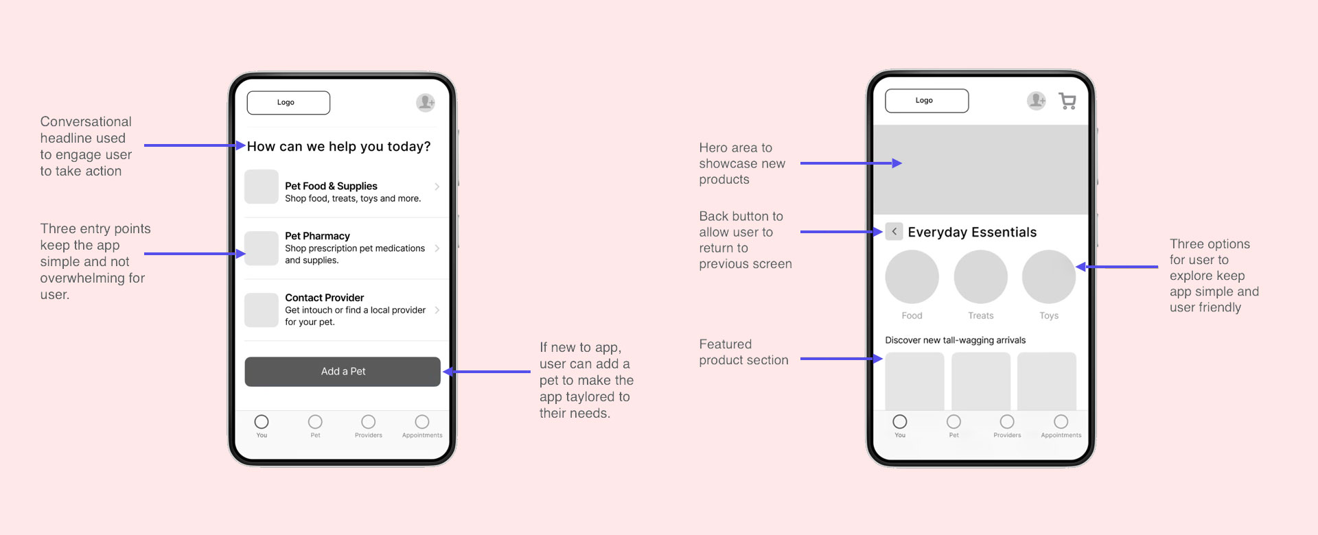
The interface is designed to feel clear, caring, and easy to trust — especially in moments of stress. I created a modular design system with accessibility and scalability in mind.
Key visual principles:
Soft color palette for emotional warmth
Strong visual hierarchy to guide action
Mobile-first design with focus on clarity
Impact Highlights
To surface user value more clearly, here are key outcomes from testing:
80% of testers found the autoship feature “extremely useful”
Users described the UI as “clean,” “reassuring,” and “intuitive”
Accessibility tweaks (contrast, spacing) got positive feedback from all testers
Paws+ showcases how thoughtful, user-centered design can reduce stress and simplify care—making life easier for both pets and their humans.
What I Learned
Paws+ reminded me that design isn’t just about removing friction—it’s about creating confidence. When the stakes are personal, even small UX decisions can offer peace of mind. This project deepened my belief that thoughtful, human-centered design has the power to support people when it matters most.