Creating a Seamless Digital Experience for The Paint Studio
Project Overview
Ace Hardware’s Paint Studio needed a more intuitive and inspiring way to help users explore color online. The goal was to replicate the in-store paint chip browsing experience while introducing smart tools that empowered users to plan, personalize, and purchase with confidence.
Objectives
Create a digital color browsing experience that mirrors the in-store experience.
Build a scalable platform to support interactive tools and future features.
Empower users with planning tools to simplify their project workflow.
My Role
As the UI/UX designer on this project, I was responsible for:
Creating interactive prototypes for browsing, saving, and calculating paint needs.
Collaborating across teams to align design with tech constraints and business goals.
Developing a scalable design framework for future tools and experiences.
Ensuring accessibility and intuitive navigation across devices.
Designing the Experience
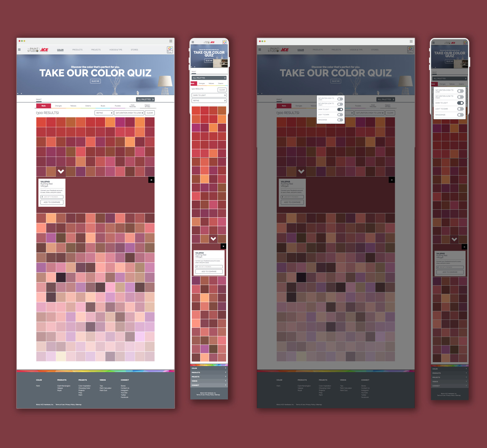
Color Browsing System
Working closely with the UI/UX lead, I helped design a visual system that mirrored how color chips appear in Ace Hardware stores—organized by brand, hue, and curated palettes. This alignment with the physical retail experience created instant familiarity and made digital color exploration feel intuitive and effortless for users.
Saved Swatches Feature
We introduced a save feature, allowing users to collect their favorite colors while browsing. These swatches could be revisited during planning and decision-making, supporting long-term project workflows.
Color Selector Page
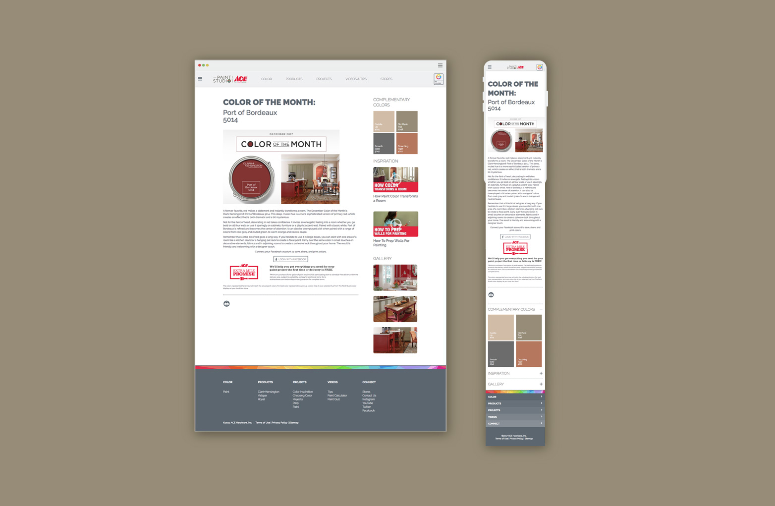
Color of the Month Page
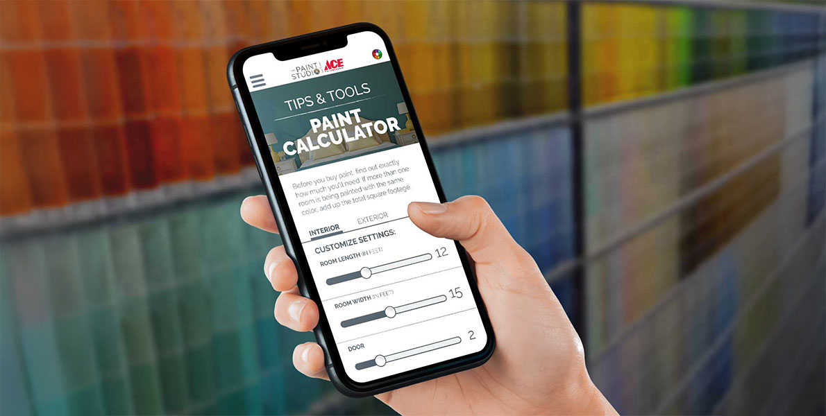
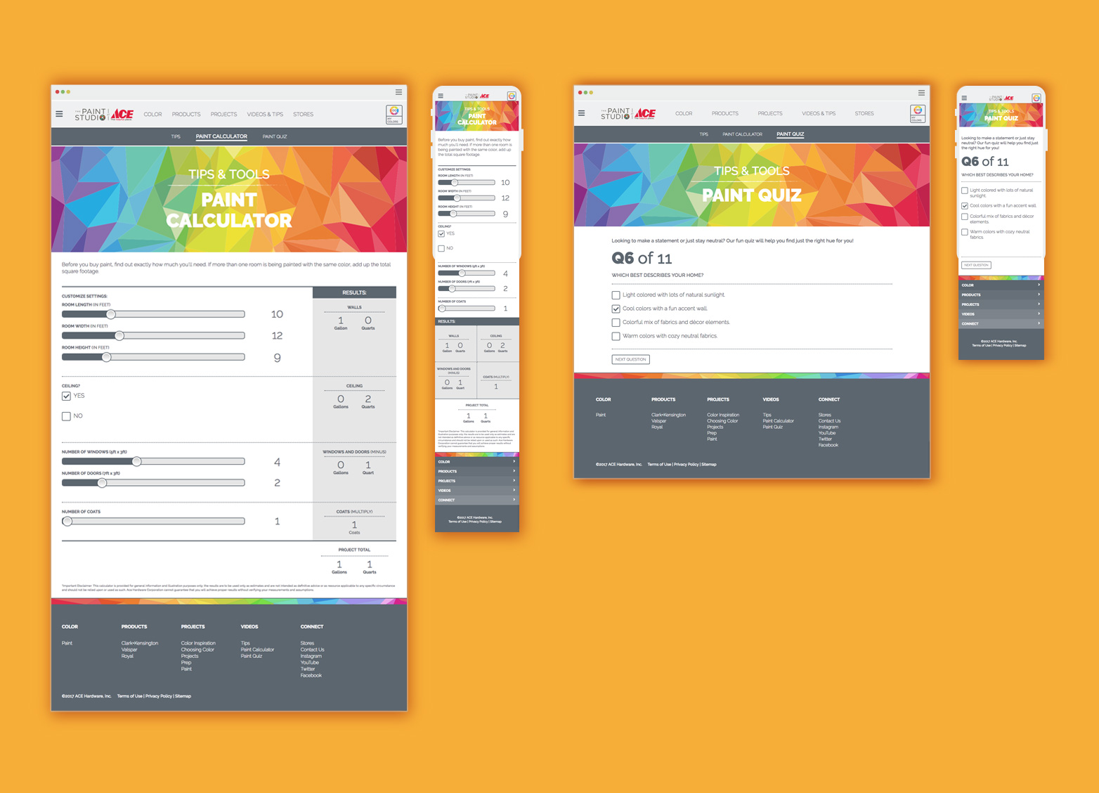
Paint Calculator + Project Tools
Paint Calculator: Estimate paint quantities based on room dimensions.
Paint Personality Quiz: Recommend colors based on user style and preferences.
Paint Tips Library: Curated advice to support project prep and execution.
Paint Calculator and Quiz Page
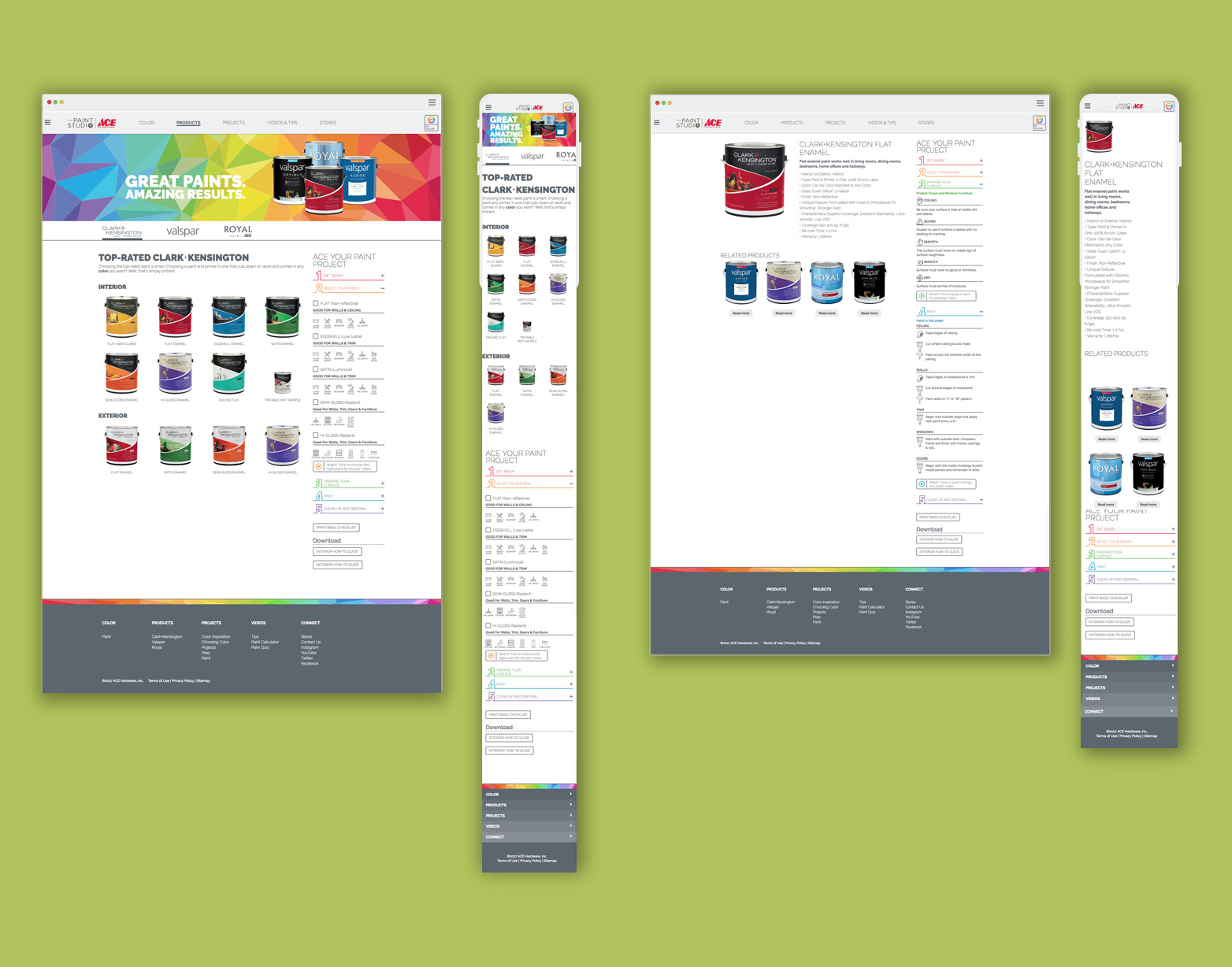
Project Checklist Integration
To support user planning across the site, I collaborated with the UI/UX lead to design a 1:3 modular component for Ace’s paint project checklist. Rather than embedding it into a single page, we created it as a flexible module that could live across multiple pages—offering helpful, just-in-time guidance during the browsing and planning experience.
Product Page with 1:3 checklist
Scalability & Accessibility
The redesign was developed using a modular approach, making it easier to support new features and updates across the site. I contributed to ensuring that the components I designed—such as the project checklist—were adaptable and consistent with the overall system. I also collaborated with the UI/UX lead to align with accessibility best practices, including considerations for contrast, type sizing, and screen reader support where applicable.
Outcome
Key Results & Takeaways:
Contributed to a more intuitive and user-friendly color browsing experience through thoughtful UI design and collaboration.
Helped bring new tools—like saved swatches and planning checklists—to life by designing scalable, modular components.
Supported a design approach that made exploring and planning paint projects online feel familiar, engaging, and easy to use.
This project highlights how collaborative design thinking can help bridge the gap between in-store and online experiences—enhancing usability without losing the tactile familiarity that customers expect from a brand like Ace.