The Caveman’s Cupboard—known for “feeding the modern paleo lifestyle”—was ready for a fresh start. Their existing packaging didn’t reflect the premium quality of their product or resonate with the expanding organic market. Brought on as the Creative Director, I worked directly with the client from concept through final delivery to revitalize their identity, packaging, and marketing materials—building a stronger foundation for shelf appeal, impulse purchases, and long-term brand recognition.
Objectives
Evolve the brand identity to align with a modern, organic lifestyle.
Design custom packaging to increase shelf impact and perceived value.
Unify the brand across products and marketing with a distinct visual language.
Create collateral to support in-store and local market visibility.
Roles & Responsibilities
As the sole Independent Creative Director on this freelance project, I was responsible for:
Leading all creative direction, client communication, and execution.
Designing a new logo system and defining a flavor-based color strategy.
Developing packaging design across multiple sizes.
Crafting marketing materials including a take-home brochure.
Managing production-ready files and delivery for all assets
Designing the Brand System
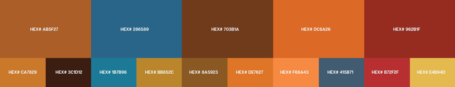
Logo & Flavor Color Strategy
The refresh started with a packaging-friendly logo centered around the brand’s original caveman icon. I established a flavor system using earthy, organic color palettes—giving each SKU its own personality while maintaining a cohesive presence across the full line.
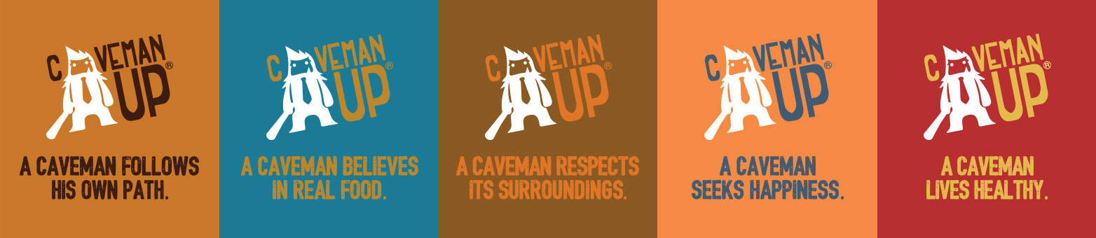
New Logo Design
New Brand Colors
New Brand Message Logo
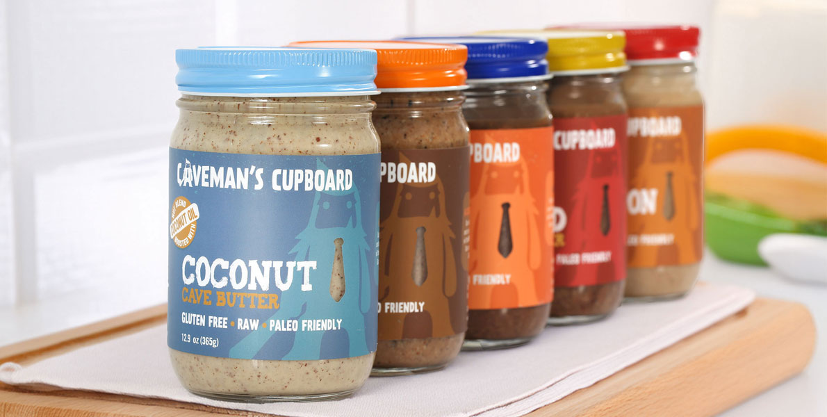
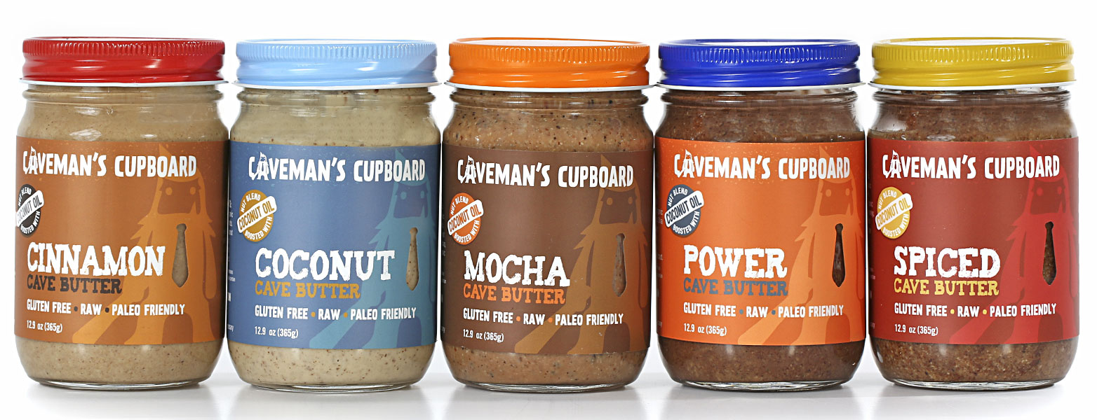
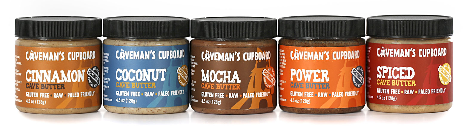
Packaging Design
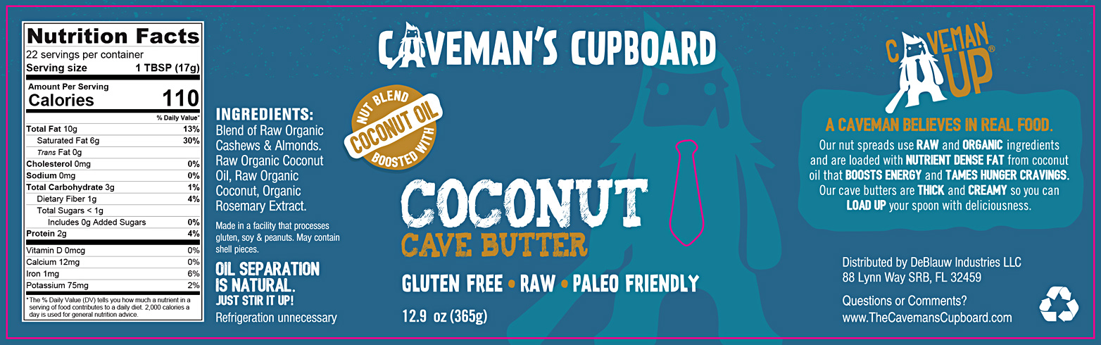
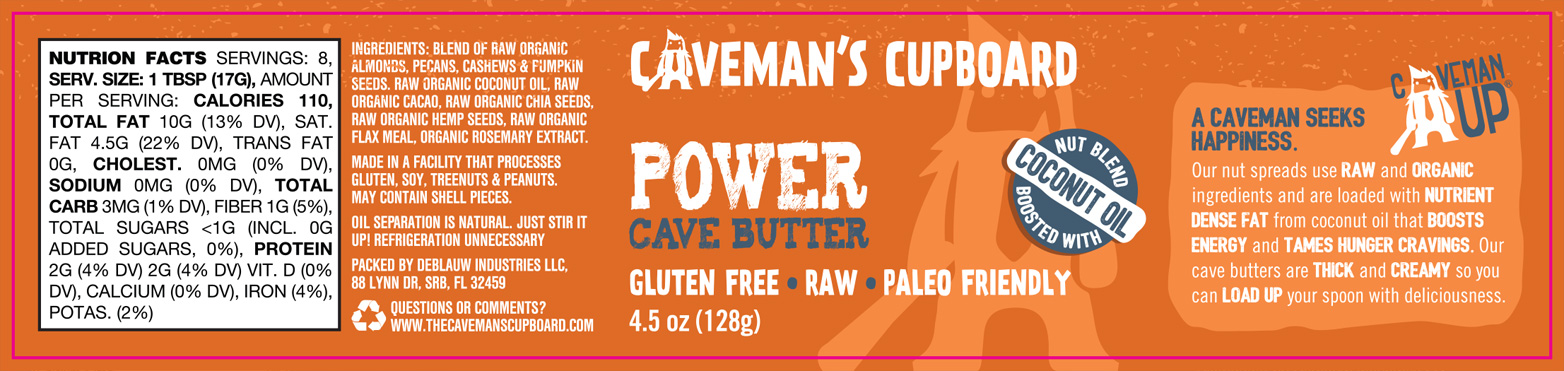
I designed custom-fit labels for both 12.9 oz and 4.5 oz jars. The labels featured a die-cut shape that framed a clear window, allowing the product itself to draw in consumers. I layered bold textures with crafted typography and introduced the playful rally cry “Caveman Up”—bringing energy and authenticity to the shelf.
Old Package Design
12.9oz Coconut Flavored Label Design
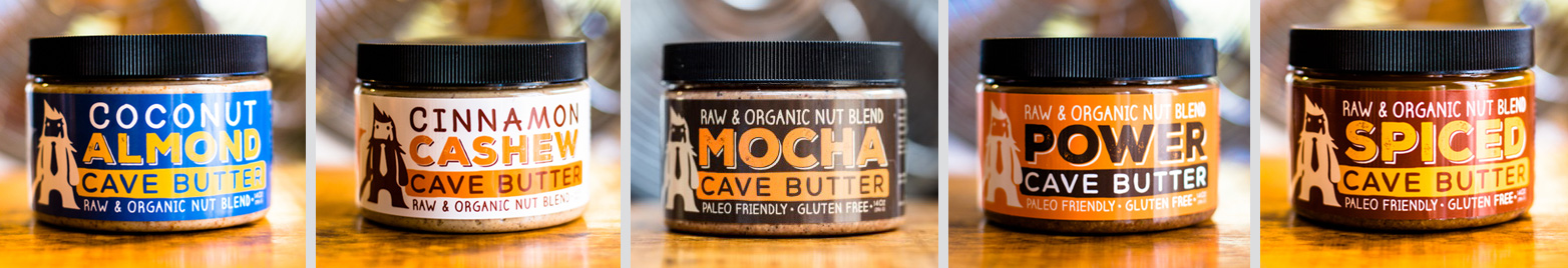
4.5oz Power Flavored Label Design
New 12.9oz Product Line
New 4.5oz Product Line
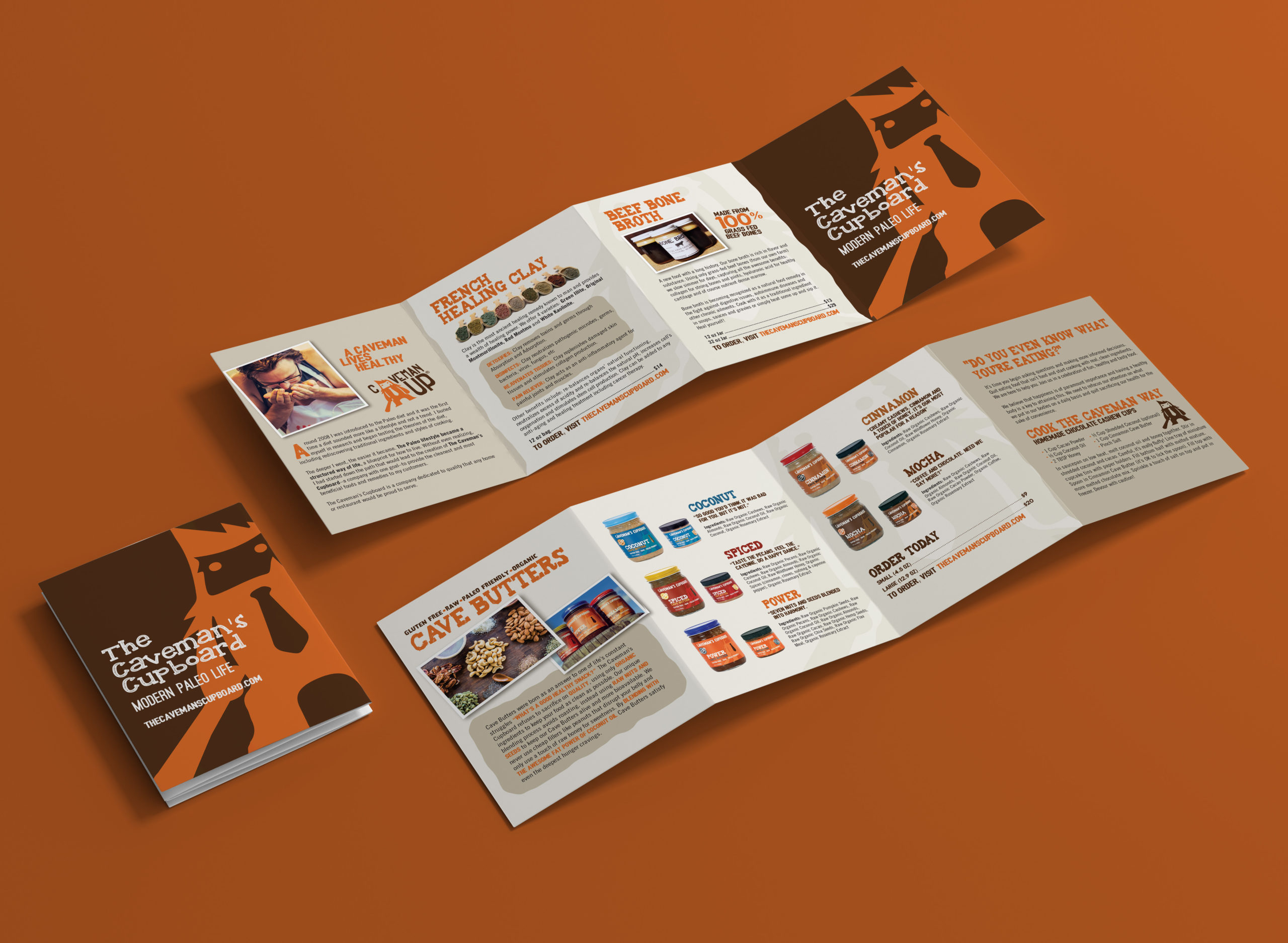
Z-Fold Brochure
To boost brand visibility at local retailers and markets, I created a compact brochure that highlighted each product, shared usage ideas, and aligned with the brand’s earthy aesthetic. Designed for tabletop display, the brochure extended the brand story into consumers’ hands.
Takeaways
This project is a great example of how a brand refresh—led end-to-end by a designer—can transform a small business. Through cohesive design and a clear visual system, The Caveman’s Cupboard went from shelf-quiet to shelf-ready, with a memorable identity and packaging that resonates with modern paleo consumers.