How a brand refresh for The Caveman’s Cupboard strengthened brand identity and recognition.
The Caveman’s Cupboard is dedicated to “feeding the modern paleo lifestyle.” Growing tired of their previous label and looking to expand their reach, The Caveman’s Cupboard turned to me for help to create a design that increases impulse purchases and brand loyalty. The design centers around the caveman character and earthy colors.
Logo Design
I started by designing a brand packaging logo and defining unique color palettes for each nut butter flavor, employing earthy tones to both distinguish and unify the product line.

New Logo Design

New Brand Colors
Package Design
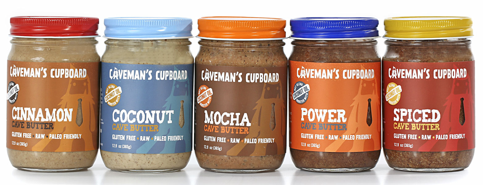
I designed labels for both large 12.9oz. and small 4.5oz. jars, customizing them to perfectly suit the client’s existing jars. To captivate the discerning premium organic market, I blended graphic and typographic textures, while introducing an eye-catching die-cut feature that artfully framed an enticing product window.
To complete the design, I seamlessly integrated impactful “Caveman Up” brand statements, infusing the final design with the brand’s essence and delivering a polished and compelling product presentation.

Old Package Design

New 12.9oz Product Line

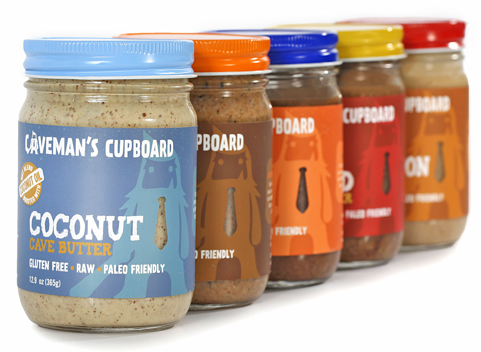
New 12.9oz Product Line

New 4.5oz Product Line

New Brand Message Logo

12.9oz Coconut Flavored Label Design

4.5oz Power Flavored Label Design
Z-Fold Brochure
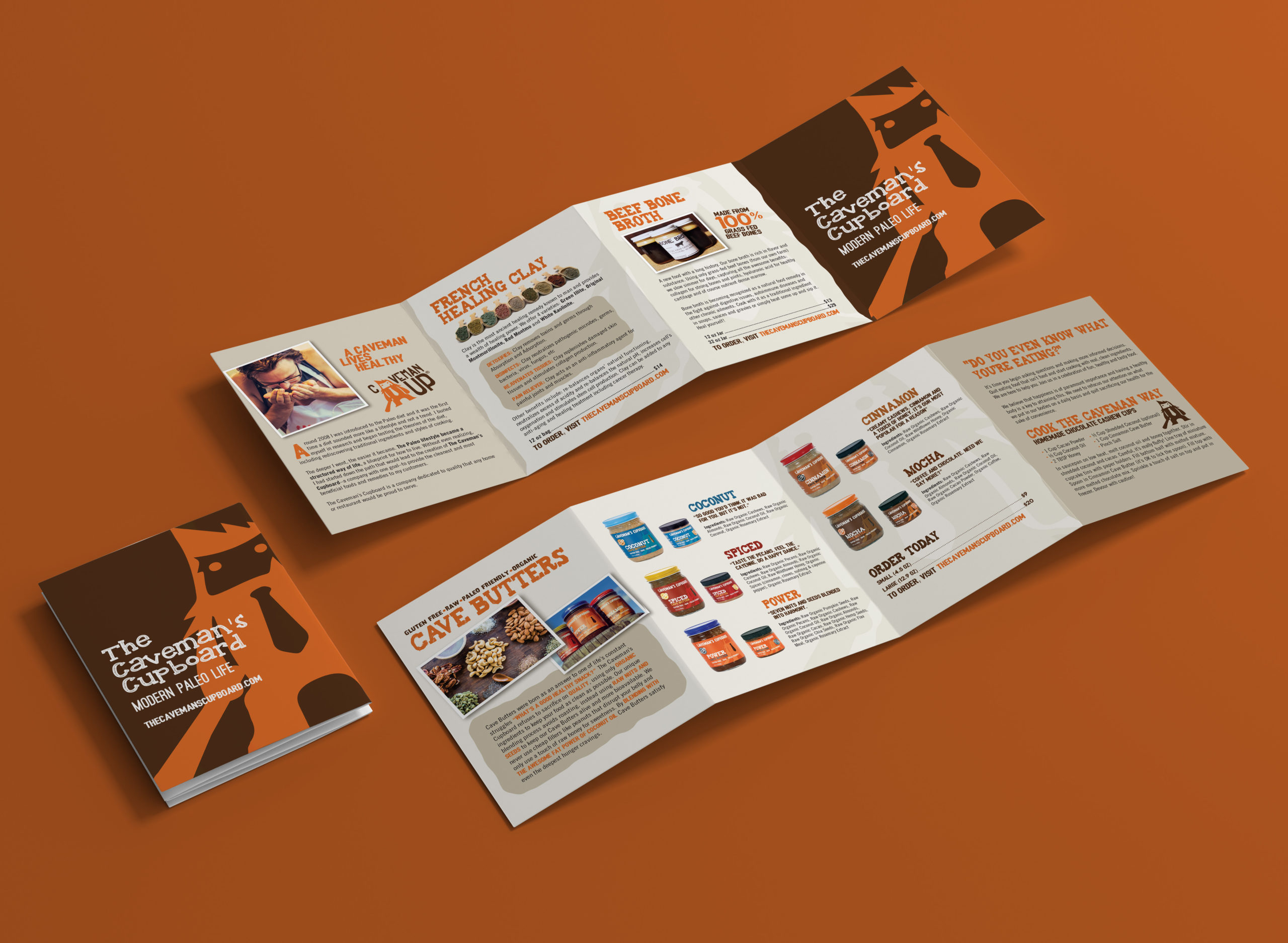
I crafted a product line brochure with the primary objectives of significantly enhancing brand awareness, providing product details, inspiring culinary creativity, and presenting the array of The Caveman’s Cupboard offerings. The client’s specific vision was to create a user-friendly, hand-held brochure suitable for prominent display alongside the products in-store and on tabletops at local area markets. To consistently convey the brand’s identity, I employed earthy tones that both differentiated and unified the brand throughout the brochure, ensuring a memorable and cohesive visual representation.

Z-Fold Brochure