Content
Applying a scalable design system across a complex enterprise website

Client
DeVry University
Role
UI Designer
Team
UX Director, Product Designer, Developers, Content Authors
Scope
Website Redesign, Responsive UI, Design System Application, Accessibility, Developer Handoff, QA/UAT
Project Overview
DeVry.edu was being rebuilt to replace an outdated website with a more modern, accessible, and flexible digital experience. Over a 2+ year stretch assignment, I learned the emerging design system and UI workflow, then grew into the lead UI designer, translating UX direction into responsive interfaces and helping carry the work through launch.
My Role
As a UI designer, I translated UX direction and an emerging design system into polished, responsive interfaces across DeVry.edu. As the project evolved, my responsibilities expanded into lead UI design, helping maintain visual quality and consistency across the experience.
My work included:
Applying Atomic Design principles across reusable UI components
Designing page layouts using an evolving pattern library
Creating and extending visual treatments for different content needs
Participating in developer reviews and implementation discussions
Reviewing implemented experiences through QA and UAT
The Challenge
Rebuilding DeVry.edu for Scale.
The existing DeVry.edu website had become outdated, difficult to maintain, and increasingly disconnected from evolving business, marketing, and student needs.
The redesign needed to go beyond a visual refresh. It called for clearer navigation, stronger content hierarchy, and a flexible foundation capable of supporting a large and growing digital ecosystem.
The challenge was bringing greater clarity and consistency to a complex website while creating a more cohesive path from discovery to inquiry.

The Approach
Learning the System.
When I joined the project, the UX architecture and Atomic Design framework were already being established.
My first responsibility was understanding how that framework worked, from structural containers and foundational typography to content objects, forms, and calls to action. At the same time, I became proficient in the team's evolving UI workflow and pattern library.
Working alongside the UX Director and Product Designer, I learned how to translate those foundations into finished interfaces across an increasingly complex website.

Translating Structure Into UI
From Wireframes to Interface.
The Product Designer provided UX wireframes and guidance on which established patterns to use. My role was to translate that structure into detailed, polished UI.
I designed page layouts and responsive experiences across DeVry.edu, applying the existing framework while creating new UI treatments when content needs called for them.
The work went beyond styling wireframes. Each interface needed clear hierarchy, thoughtful use of typography and imagery, and layouts that could adapt across screen sizes while remaining practical to build.

Designing Within the System
Adapting Components to Real Content.
Working within an established framework meant understanding not only how components looked, but how they needed to behave across different contexts.
I designed and refined UI treatments for forms, calls to action, content modules, and other reusable elements—considering hierarchy, content length, interaction states, and how each component would function within a larger page.
When new needs emerged, I worked within the existing visual language rather than treating each request as a one-off solution. This allowed the interface to evolve while still feeling connected to the broader DeVry experience.

Applying the Visual Language
Creating Flexibility Within the System.
As DeVry.edu expanded, different content types required components that could support a range of content, imagery, and page contexts while remaining consistent with the established system.
I applied existing patterns and designed new UI components when needed, creating solutions for scholarship programs, promotional content, hero experiences, testimonials, and other content needs. Each component had to work within the established visual language while supporting its own content hierarchy, imagery, and responsive behavior.
The goal was to create flexible, reusable UI solutions rather than one-off designs, giving teams more ways to build distinct experiences while maintaining consistency across DeVry.edu.

Designing Across Breakpoints
Creating Responsive Experiences.
The work also needed to translate across desktop and mobile without losing hierarchy or clarity.
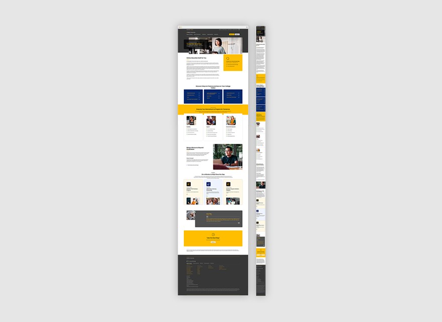
As I designed responsive layouts, I considered how content should reorganize as space changed, how imagery scaled or repositioned, how modules stacked, how calls to action remained visible, and how information hierarchy carried across screen sizes.
Rather than treating mobile as a reduced version of desktop, I used the established framework to make deliberate layout decisions for each breakpoint while preserving the intent of the experience.
Maintaining Design Quality Through Launch
QA & UAT.
As pages moved through development, I participated in QA and UAT to help ensure the implemented experience remained aligned with the approved UI.
I reviewed builds across page types and screen sizes, documenting visual and functional inconsistencies in areas such as spacing, typography, imagery, component behavior, and responsive presentation.
Issues were reviewed with the team and returned to development for updates, helping maintain design quality and accessibility through launch.

The Result
A New Foundation for DeVry.edu.
The redesigned DeVry.edu experience replaced the previous website with a more modern, accessible, and flexible digital foundation.
Following launch, the new experience showed measurable improvements across discovery, engagement, navigation, and inquiry behavior:
+60% Navigation Activity
+59.7% Organic Search
+36% Visit-to-Inquiry
+34% Start Inquiries
−34% Bounce Rate
+34% Page Views
+36% Direct Traffic
Beyond the performance gains, the component-based approach gave DeVry greater flexibility to evolve the site over time. Web authors could use established components in AEM to create new pages, while the growing component library provided a foundation for future development.
Conclusion
Growing With the System.
The DeVry.edu redesign transformed an outdated website into a more modern, accessible, and flexible digital experience, one that could support a wide range of student needs while giving internal teams a stronger foundation for continued growth.
Over the course of the 2+ year project, my role grew along with the experience. I went from learning an evolving design system and UI workflow to becoming the lead UI designer, applying established patterns and designing new components across responsive pages and experiences.
The project strengthened my ability to work within a complex enterprise environment, translate UX direction into polished UI, design with accessibility and scalability in mind, and maintain design quality through QA and launch.

