Content
Reimagining a legacy incense brand for a new generation.

Client
GONESH®
Role
UI Designer
Team
Account & Production Partners
Scope
Brand Strategy, Naming, Creative Direction, Identity, Packaging, Social
Spark Something Different
GONESH® wanted to move beyond the traditional perception of incense and connect with a younger, more culturally diverse audience.
Rather than simply making the brand look younger, I focused on what actually sparks people—their passions, communities, experiences, and the moments that make life meaningful.
That thinking became the foundation for Sparkz Sticks.
The Challenge
Changing the conversation around incense.
Incense carried a strong association with cannabis culture and a relatively narrow audience. GONESH® saw an opportunity to broaden that perception and make incense feel relevant to a new generation.
The challenge wasn't simply to make incense look younger. It was to make GONESH® feel like something this audience would naturally want in their lives.
Understanding The Audience
Gen Z isn't one aesthetic.
I looked beyond traditional demographics and explored the communities, interests, and cultural spaces shaping how younger audiences express themselves.
Music · EDM · Action Sports · Fashion · Social Media · Pop Culture · Outdoor Culture · Lifestyle Brands
The goal wasn't to find one universal “Gen Z” look.
It was to understand how different communities expressed themselves—and identify the visual languages, attitudes, and experiences that could make Sparkz feel authentic within them.
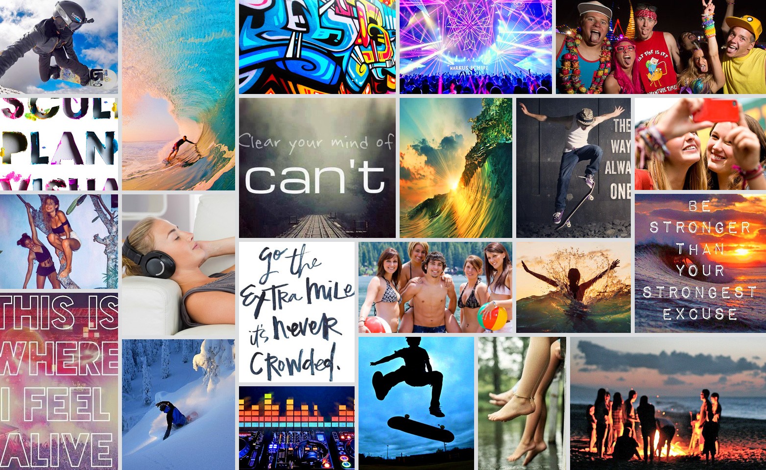
Finding The Visual Language
From audience insight to creative direction.
The exploration revealed a common thread across very different communities:
Expressive. Energetic. Human. Culturally specific.
I explored typography, photography, color, graphic treatments, and visual effects that felt closer to the cultures surrounding the audience than traditional incense branding.
Rather than forcing every product into one aesthetic, I built a flexible visual system that could speak differently to different communities while remaining recognizably GONESH®.

Meaningful Moments
From product to personal experience.
The creative direction centered on a simple thought:
The things that matter most aren't material. They're the experiences we have.
Relaxation.
Adventure.
Togetherness.
Joy.
Memory.
Self-expression.
Instead of positioning incense as the product, GONESH® could become part of the moments people actually care about.
That led to a simple question:
What sparks you?
Naming The Product
From a feeling to a product people could identify with.
The name Sparkz grew directly from the idea behind the brand: the people, passions, experiences, and moments that spark something in us.
Rather than naming the product around incense itself, Sparkz gave the brand a more emotional and contemporary point of view—something that could connect to different interests, attitudes, and ways of life.
It also created a flexible foundation for the individual collections, allowing each one to represent a different kind of spark.

Building The System
One brand architecture capable of supporting five worlds.
With the Sparkz idea established, I began developing a flexible visual system that could hold very different creative expressions without losing brand recognition.
The core package architecture remained consistent across the collection—logo, product information, format, and key brand elements—while color, typography, imagery, and graphic treatments could change from one world to the next.
The result was a system designed to feel cohesive without feeling repetitive: one recognizable Sparkz brand, with enough flexibility for each collection to have its own voice.

The Packaging
One system. Five distinct worlds.
Rather than giving every product the same generic "youth" treatment, each scent was given its own cultural point of view.
The result was a collection of distinct visual worlds that could speak to different interests and communities while still feeling unmistakably Sparkz.

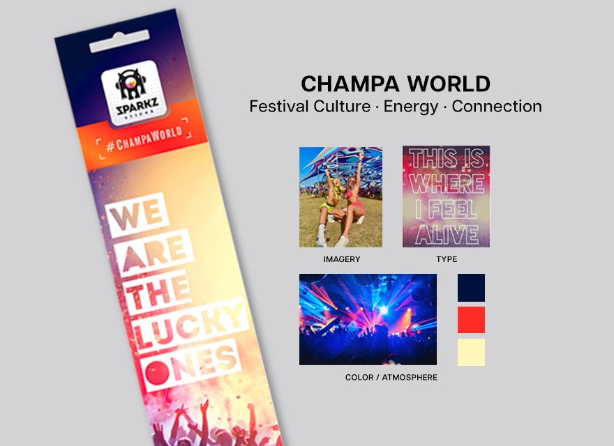
CHAMPA WORLD
Festival Culture · Energy · Connection
The Champa World direction was inspired by the energy and social experience of live music and festival culture.
I explored expressive typography, saturated color, photography, and imagery that captured the feeling of being surrounded by people, music, and shared experiences.
The result was a visual world built around energy, connection, and shared experience.
XTREME RUSH
Defiance · Determination · Self-expression
The Xtreme Rush direction drew from the rebellious spirit of skate culture and the mindset of pushing beyond limitations.
I explored skateboarding imagery, expressive typography, and raw graphic treatments to capture individuality, attitude, and determination.
The result was a package built to feel as energetic and unapologetic as the culture that inspired it.

BLU AURA
Independence · Freedom · Excitement
The Blu Aura direction was inspired by the independent spirit and energy of surf culture.
I explored surfing, water, and summer lifestyle imagery alongside expressive typography and vibrant color to capture the feeling of creating your own path and embracing the moment.
The result was a visual world built around freedom, movement, and individuality.

ENDLESS SUMMER
Connection · Relaxation · Presence
The Endless Summer direction was inspired by the rituals of warm-weather living — time outdoors, shared experiences, and the moments that make summer feel endless.
I explored lake life, outdoor gatherings, warm-weather imagery, and relaxed lifestyle references to capture the feeling of slowing down, enjoying the people around you, and being present in the moment.
Those influences shaped a visual world centered on connection, warmth, and the freedom to slow down.

PURE CHILL
Challenge · Perseverance · Adventure
Pure Chill draws from snowboarding, winter sports, and mountain culture—the mindset of pushing beyond your comfort zone and going further.
Those influences shaped a visual world built around challenge, focus, and the feeling of pushing beyond your limits.

Creative Direction
From concept to execution.
I led the creative development of Sparkz Sticks from positioning and naming through visual identity, packaging, and social.
I established the creative strategy and visual direction, presented concepts, and partnered with off-site designers to bring the system into final execution. I remained involved throughout development, providing feedback and ensuring the work stayed true to the original strategy.
The Result
Sparkz Sticks gave GONESH® a new cultural voice—one built around individuality, experiences, and the moments that spark something in us.


